
Traveling is one of the best things that you can do for your health. It helps your physical and mental health, with many travelers saying that it’s also excellent for the soul…. Read More »
Author: admin
Building a successful website
Who does not want to have a website these days? Every freelancer, entrepreneur, a startup, small to medium companies, and let’s not forget the multinationals wants to have an online presence. Why? Simply because that is how their customers can easily know about them and trust them.
Being in this business for over 10 years, I have seen hundreds of websites been built and rebuilt for one purpose alone – better quality and technology upgradation. If you wish to do one of those “Do-it-yourself” websites, you still might require some technical assistance. Many fail to understand that besides the marketing, website is a whole world in its own and one aspect cannot just make it successful. Here are my 10 tips to building a successful website.
- Plan for the project
Take a notepad and start brainstorming on the ideas of your website. This needs to include the look and feel of the website, the sections or categories of the services or product that you have, keyword analysis, and layout of the website. If you are good at creating workflows, design a simple diagram about the website’s structure which can help you at later stages. - Keyword Analysis
Next step is identify the keywords that customers use to search your service or product in the Google’s search result. This is the main and difficult part for most. You need to understand the Google Adwords and use the Google Adwords Keyword Tool to find the popular keywords related to your category. Select the ones with the higher volume and check each of them for competition in Google Search. - Select a Reliable Web Host and Available Domain Name
Keeping in line with Google SEO, a keyword sensitive domain name is a great choice. The difficult part is to understand whether you want the domain name for branding purpose or for better Google search. Choose a .com domain name because it has an inherent quality of gaining trust easily as compared to others.
For hosting, choose a company that has the ability to grow if you anticipate more traffic in the next few months. If your website’s success is based on huge traffic, then VPS hosting will be best for you. If the traffic is normal, then a shared hosting account will suffice. Cheap hosting does not always guarantee a great service. So, try to look for a hosting that is neither cheap nor expensive. - Build a Website from Scratch or using a Content Management System
Using a Content Management System (CMS) is the most common choice people opt for when they frequently need to update or expand the website content. If you know the HTML coding skills, then you can build a static basic website that does not have a backend, and is a non-expensive solution. On the other hand, WordPress blog will be best if your website publishes news. Or if you are on a budget, you can choose from hundreds of WordPress Themes and Plugins to build your own website. - Website Templates
Whether it a regular website or a CMS based website, a ready to use template is always a good choice when the design-budget is limited. Do not get caught up in the looks of the design because it can always lead to problems in the long run if you are not familiar with it. Stick with the design layout that you created in the first step. You can add special effects such as animations or Flash templates, but then again, it requires knowledge of the Adobe family. - Content for the Website
The keyword analysis that you did in Step 2, comes in play here. When writing the content of the website be mindful that in order to rank up in Google Search, the usage of a set of 3 to 5 keywords in each page or website section is recommended. Again, this can be adjusted depending on the length of the text. The most important thing is to use the keywords in the Page Titles and Headings. That is why people spend more time on the content writing of the website. - Build the Website
The building process is very limited when using a CMS based website. Other than installing some extensions such as SEO plugin or a search engine module, it is a fairly simple process. On the other hand, when building a website from scratch, the website template needs to be converted in a website. Different header tags (h1, h2 and h3) are used together with “alt” attribute inside the image tags. Do not use Meta keywords as search engines mostly ignores them. However, you can use Meta description as a preview of description about your website. - Test your Website
Testing phase! Once the website is built, it is time to check the errors, issues, and problems in different web browsers. Have a beta testing done by people around you – not part of the project. - Website Statistics
One more step before you publish the website – understanding how you can see the visitor statistics on your website. Software like Google Analytics is currently the best possible solution for easy and quick learning. This software can be used to learn the bounce rate, page hits, views, reach and so much more. All you have to do, is create a profile in Google Analytics and add a tracking code on every page of your website. You are all set then. - Publish and Promote the Website
Once you publish the website, the next and final step is to promote it so that the reach can be increased. There are many ways to do it. You can formally write a press release to your customers or partners about the launch of new website. You can use word-of-mouth marketing, or spread it in using a community if you are part of any. Other than these, there are paid advertising options as well which you can choose from depending on your budget.Now that you have the basics of setting up and launching your own website, have a fun time in the world of websites.
Great collaboration is the foundation of great product
It has been seen most of the time that designers and developers are made to sit in different cubicles labeled as Design Department and Development Department. When a developer is made to work in a corner in isolation from the design process, it prevents the developer to help in crafting the end product. The person who suffers is the end user.
What many fail to understand that better products for the users are only successful when design and development work together in a harmony. It is my belief that design and development work from the start which allows both of them to have a clear vision of the end user – provide the best product to our customer.
Imagine cogs in a machine that make the machine work. When you remove one of the cog, it fails to make the machine work. Developers and designers are cogs in a product that need to work together to deliver the work. When one fails, the whole system collapses.

Change the Pre-historic Notions about Roles
The notions –
- Developers do not need to be involved in the product’s creatives because it is not their job.
- Usability of the product depends on the designer, not the developer.
- It will be waste of developer’s time to be involved in these matters
These notions, to this day hold true in large organizations, where there is a strong line of separation between roles instead of having cross-functional teams. Is the separation an organizational thing or a departmental role thing? The answer is “It is true for both.” Developers see design a thing that is beneath them, and vice versa.
It is only when these pre-historic notions, that have carried themselves to our tech-era, are removed that the distinction between designers and developers can be overlooked, and thus can then be used for mutually inclusive benefit for bringing out a great product for the users.
Design and Development – Not Just for the Respective Teams
Many a times, I have heard developers and designers exclaim vehemently that usability and development is not their responsibility respectively and sign when they actually have to a attend meeting. “We are required to build the engine, why should we care about the page navigation?” claims one of the developers. Or, “Adding a product to the cart is not our job!” signs one of the designers. This narrow view is explained by Paul Boag as “Exclusion of developer of designer from the process will do nothing but prevent the product from living up to the expectations.”
My process is fairly simple – include designers and developers from the start of the project rather than asking their input along the way when required. This helps the designers to understand the restrictions that developers may have when implementing a certain design, and vice versa. Personally, I think that this approach has done me wonders – my clients have always been happy with the outcome of the project and if I may quote one of the client “It was more than what we had expected!”
The internal benefits I found were:
- Both the designers and developers had appreciation from other’s work.
- Both realized that they can learn from one another.
- Less blame game.
- Shared ownership and pride in the project.
Of course, there are times when development and design teams do not necessarily have to together but what I am talking about is open collaboration between both the teams which calls for designating an emissary.
Designating a Technical Emissary – The Project Manager
Over the years, I have experienced that when all the designers and developers meet, there is a lot of frustration and little or no work. Plus, meetings are boring most of the time. What I have learnt is that, team lead from each department meet with the technical emissary or the “project manager” to discuss the project and the information pertaining to it.
The benefits are:
- The entire development or design team’s time is not lost.
- Technical concerns reach the technical people and are timely answered.
- All the teams work collaboratively and are aligned with the project goals.
The thing to be careful about here is to make sure that the information discussed in the meeting is disseminated to the concerned team members. The communication method is the backbone of the dissemination. Many use, project management systems while others prefer email or skype. In my opinion, online project management system works best so that everyone can see every information in one place.
Involvement is the KEY
The common assumption that once project leaves the design phase and reaches the development phase, the responsibility becomes that of the development team, and the vicious cycle of blames begin. If the entire team is involved from the start – as I been focusing on – the blame never exists. The problem exists only because the designers think that it is the developers job and vice versa.
Therefore, it is important to include the designers and developers in the start – the benefits will start becoming obvious once the project reaches the end phase. It is a simple formula – my formula – “Involve everyone in the beginning so that everyone knows what is going on and what is going to happen – leaving no room for failure.”
What To Consider When Choosing A WordPress Theme
Economists have taught us that a lot of choice is not always a good thing. Having many options can lead to “analysis paralysis” and a feeling of being overwhelmed, due to the increased effort required and the level of uncertainty in making the right choice.
With a nearly unlimited pool of WordPress themes to choose from, it becomes so easy to feel overwhelmed and resort to inaction or choosing a low-quality theme. In cases where you have a lot of options, it pays to know exactly what you need.

“Premium WordPress themes” Google search. (View large version)
Put another way, how much easier is buying a bottle of wine when you know that you prefer reds and that your favorite red is Australian Shiraz? This small amount of knowledge cuts a choice between 500 bottles in a store down to 10.
In this post, I’ll share what I believe are the most important factors to consider, so that you know exactly what to bear in mind the next time you’re on the hunt for a good theme.
To start off, let’s answer one of the most common questions asked: Is it worth paying for a WordPress theme, or can you get away with a free one?
1. Price: Free Vs. Premium Themes Link
Several years ago, the price of a theme was a good indicator of its quality. Free themes were often poorly coded at best, and were used to capture sensitive user data at worst. But times have changed, and developers in the WordPress community have created thousands of great free themes to choose from.
As such, there is no conclusive winner. Both free and premium themes have their pros and cons, which are detailed below.
PROS OF PREMIUM THEMES
- More updates
Perhaps the most compelling reason to choose a premium theme is that such themes are typically updated more often. Given the rapid evolution of the WordPress content management system (CMS), having a theme that is regularly updated to patch new security issues is critical. - Less recognizable design
Because free WordPress themes are so popular, it’s not uncommon for tens of thousands of websites to use the same free one. Premium themes are less common, which set them apart a bit more. - Better documentation
Most premium themes include a detailed PDF explaining how to get the most out of them. Such documentation is less common with free themes. - Ongoing support
Premium theme developers certainly offer the best support, usually through a combination of a public forum, live chat and an email ticketing system. Free themes usually just have a public forum for support. - No attribution links
Many free themes often require a link to appear in the footer crediting the theme’s author. While this is becoming less common in free themes, you can be sure that no links are required in premium themes.
CONS OF PREMIUM THEMES
- The price
You’ll have to invest anywhere between $50 to $200 in a premium theme. - More configuration
Most premium themes have their own custom administration panel, with a variety of customization settings, which can take a while to learn and set up. - Unwanted features
Premium themes tend to include a lot of bells and whistles, such as multiple slider plugins, a portfolio manager and extra skins. While these do make a theme very versatile, a lot of unwanted features will bloat the theme.
In general, the most important aspect to look for in a theme, whether free or paid, is the quality and care that’s gone into making it. The quality of the code will influence everything we discuss in this article, from security to page speed.
The easiest way to gauge quality is to read what customers are saying. If a theme has a public support forum, read what kinds of issues people are having, and how responsive the developers are in resolving them.
2. Speed: Lightweight Vs. Feature-Heavy Themes
In my last post here on Smashing Magazine, I emphasized the importance of optimizing website speed. Fast page-loading speed does not just improve the general user experience of a website, but has also been confirmed to improve search engine rankings, conversion rates and, thus, online revenue.
It should come as no surprise that I recommended avoiding sluggish themes like the plague.
Understanding a problem is the first step to avoiding it. So, what causes a theme to drag a website’s page speed into the gutter?
In general, it comes down to three things:
- Too feature-heavy
Be wary of themes that boast 10 different sliders, 20 preinstalled plugins and a lot of JavaScript animation. While this might sound like a good deal, no website that makes HTTP requests to 50 JavaScript files will run optimally. - Overuse of large file formats
The keyword here is “overuse,” which admittedly is a bit subjective. Try to steer clear of themes that use a lot of full-width images, background videos, etc. Less is more. - Poor coding
From wildly scaled images to inline CSS injection, poor coding has a significant impact on website performance. As mentioned, poor code usually means that a theme hasn’t been updated in a long time, so always check a theme’s update history.
Here’s a litmus test you can use to figure out how bloated a theme is. Go to the Pingdom Website Speed Test, enter the URL of a theme’s demo and see how long the page takes to load and how many HTTP requests are made.
Let me give you a quick comparison as a benchmark. Earlier this year, I built two websites with very different theme frameworks. The first website, BrokerNotes, was built with the Frank theme (a very lightweight theme designed for speed). According to Pingdom, the home page makes 38 HTTP requests and loads in under 1 second. 3.9 Mb in bandwidth is way too heavy though.

BrokerNotes’ website statistics. (View large version)
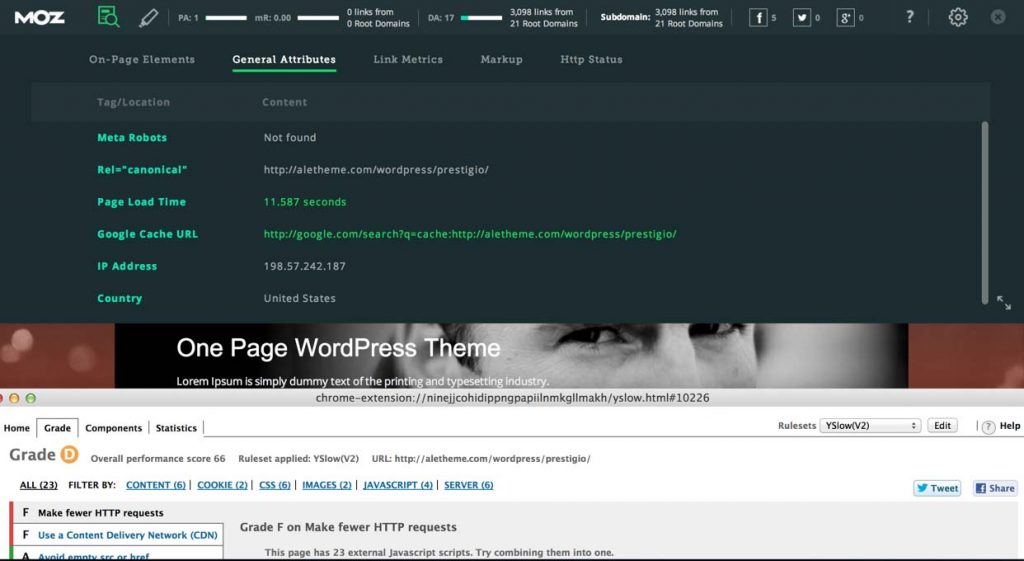
Now, let’s compare this to Qosy, a website I built using a relatively feature-heavy theme. As you can see, the home page makes 61 HTTP requests and take just over 2.5 seconds to load. While still not bad, that’s a noticeable increase in loading time.

Qosy’s website statistics. (View large version)
Themes that make hundreds of HTTP requests before showing any content are not uncommon. Avoid them unless you’re confident that you can slice off some of that fat.
3. Design And User Experience
Of course, the purpose of a theme is to make your website look great and show off your brand in the best possible light. While design can be quite subjective, you will boost your odds of finding a well-designed theme by following a few steps.
Not a pretty website at all! (View large version)
First, search on websites where the best designers sell their themes. This might sound obvious but is still worth mentioning. ThemeForest is my personal favorite, but plenty of other good ones are out there, including StudioPress and Elegant Themes.
Secondly, spend some time browsing the demo. Does the website feel easy to use? Is there enough white space? Do you get a headache looking at it? Does it excite you? This is where your gut feeling plays an important role.
Finally, be sure to choose a theme that is cross-browser compatible and has been built with accessibility in mind.
4. Responsiveness
While mobile traffic varies between industries, most reports seem to agree that, on average, about 30% of all website visits now come from mobile and tablet devices.
Regardless of the exact ratios, there’s no excuse to use anything but a responsive theme.
Thankfully, virtually all reputable themes are mobile-friendly out of the box, so the lack of responsiveness in a theme is really a red flag. Most theme vendors allow you to filter out themes that are not responsive. Another good option is to look through a curated list of responsive themes.
One of the best ways to determine whether a responsive theme is good or not is to run the demo through Google’s new mobile-friendliness tool.
5. SEO
When enabled with one of the many good SEO plugins, WordPress is one of the most SEO-friendly CMS’ around.
However, plenty of themes render all manner of on-site SEO mistakes, such as the omission of header and alt tags, full-blown duplicated content and dynamic URL errors.
When choosing a theme, look for “SEO optimized” or “SEO ready” in the theme description, but don’t trust it blindly. A lot of developers include this to check of a box and sell their theme. That being said, knowing that a designer has at least considered SEO when developing their theme does offer some assurance.
A good practice is to install an extension for the Chrome browser, such as MozBar or SEO Site Tools, to run some quick SEO checks on a theme’s demo.
MozBar in action. (View large version)
Explaining what to look for is beyond the scope of this article, but that has been covered in depth by Joost de Valk.
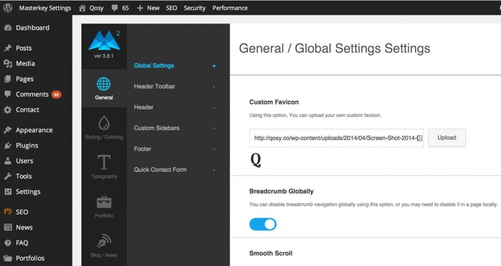
6. Ease Of Customization
A customization dashboard has become standard in a lot of themes. This saves you the hassle of having to make direct changes to style sheets.
A theme customizer. (View large version)
In addition, plugins such as Visual Page Editor make it easy to build complex page structures without having to touch code. While some of these WYSIWYG editors are somewhat limiting, I find that overall they’re very beneficial to getting a website looking very nice with little effort. If a developer has a demo of their administration panel, I’d recommend playing around with it to make sure you can customize everything you need to.
7. Security
A lot affects the security of a website, including hosting, plugins and password strength. Daniel Pataki has already covered some great steps to secure your WordPress installation. This should not be an afterthought; rather, consider it when selecting your theme.
As when you’re buying a home, one of the best things you can do to gauge a theme’s security is to read what customers say about it. Unless a theme was created by a trustworthy developer, I avoid any theme that doesn’t have many downloads or reviews.
My advice is to evaluate themes on community websites like ThemeForest, where all customer reviews are displayed by default. This level of transparency tends to reveal the truth about themes, which you wouldn’t get directly from a developer’s website.
While buying a theme directly from its developer’s website is fine, do so only after evaluating it on a community website with transparent reviews.
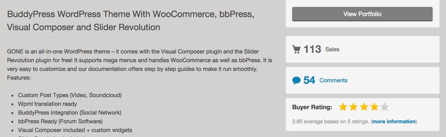
Theme reviews. (View large version)
If a theme has a security loophole, then customers have probably picked up on it and flagged it in their reviews for future customers. While the developer might have fixed such issues, the overall ratings from customers should give you an idea of a theme’s overall quality.
Conclusion
While ticking off all of these boxes might sound ambitious, the truth is that they’re interrelated, and they all come back to a single point: Themes should be built with quality in mind.
One of the best things you can do when choosing a theme is to learn about the person or company who made it. If they have a reputation to live up to, then their themes will undoubtedly be of a higher quality than developers who don’t.
Of course, no theme is perfect, and you’ll almost always have to make some compromises. That being said, with the recommendations in this post, you are hopefully now better informed to avoid the really bad themes and to choose one that is fast, well coded and SEO-friendly and that includes all of the features you need.
(dp, il, al, ml)
Testing Credit-Card Numbers In E-Commerce Checkouts (Cheat Sheet)
As a developer, I work a lot with e-commerce websites and, as a result, with a lot of payment gateways. I’m fortunate that I get to work on many different projects for different clients, each with its own unique challenges. I have, therefore, found myself working with a lot of different payment gateways over the years, from the more familiar ones like PayPal and Stripe to some lesser known ones.
While I love the variety of my work, I generally find working with payment gateways to be frustrating. I’m sure I’m not alone in this opinion! For many payment gateways, the documentation is poorly written, lengthy and, at times, difficult to find.
Thankfully, libraries such as OmniPay have helped me a lot and bring some consistency to working with the different services. However, while these libraries remove some of the need to check documentation, testing often still requires me to dig it up.
Testing is a crucial part of the development process, from initially setting up a payment system to the continual testing of a checkout process. For each stage, we need to work with test payment cards to run our code through the hoops and ensure the interface works well. I doubt any of us are paid well enough to happily reach for our wallet and put through a genuine payment with our own credit card! So, we look for the test payment card details relevant to the gateway we’re working with.
Even if we’ve already found the appropriate documentation at the beginning of development, what about a month or two later when we need to retest something? How about a year later, when everything has moved around on the official website of the payment gateway? Documentation easily gets misplaced, and we find ourselves hunting around for it. Even once we have our hands on it, locating the test details can be a challenge. Some gateways seem to love providing multiple PDF files, all mysteriously titled, with the test card details buried deep within one of them.
I have been increasingly finding myself in this situation. Moreover, developers aren’t the only ones who need these details in the course of a project. There are project managers, QA testers and the clients themselves. I was getting fed up with searching for card numbers. So, earlier this year, I decided to do something about it.
Back in April, I set up a new repository on GitHub and started compiling a list of all of the payment gateways I’ve used over the years and the test card numbers available for each of them. The idea was simply to create a single accessible resource of card numbers and other relevant details required to put test payments through.
I chose to host the list — or cheat sheet, if you will — on GitHub so that it could easily be maintained and updated. By making it a repository, others can quickly fork and contribute to it themselves, adding other payment gateways to the ones already represented. I released the cheat sheet under a Creative Commons Attribution-ShareAlike license to encourage people to share and adapt the list.
So, here are the test card numbers for some of the major payment gateways and a few lesser known ones.
PayPal
One of the largest online payment companies, PayPal is a popular choice with clients for its recognizable brand (even if it is less popular with those who have to implement it). The following test cards are available in PayPal sandbox mode and can be used with any card expiry date set in the future.
| Card type | Card number(s) |
|---|---|
| American Express | 378282246310005 and 371449635398431 |
| American Express Corporate | 378734493671000 |
| BankCard (Australia) | 5610591081018250 |
| Diners Club | 30569309025904 and 38520000023237 |
| Discover | 6011111111111117 and 6011000990139424 |
| JCB | 3530111333300000 and 3566002020360505 |
| MasterCard | 5555555555554444 and 5105105105105100 |
| Visa | 4111111111111111, 4012888888881881 and 4222222222222 |
Stripe
Stripe is a much younger (and, may I say, trendier?) payment company than PayPal. It has quickly proven to be popular with developers, thanks to its simplicity of implementation and solid documentation, which is always a plus.
All of the following card numbers will produce successful transactions in test mode using any future expiry date.
| Card type | Card number |
|---|---|
| American Express | 378282246310005 and 371449635398431 |
| Diners Club | 30569309025904 and 38520000023237 |
| Discover | 6011111111111117 and 6011000990139424 |
| JCB | 3530111333300000 and 3566002020360505 |
| MasterCard | 5555555555554444 |
| MasterCard (debit) | 5200828282828210 |
| MasterCard (prepaid) | 5105105105105100 |
| Visa | 4242424242424242 and 4012888888881881 |
| Visa (debit) | 4000056655665556 |
Full details of Stripe’s test cards can be found on the “Testing” page of its documentation.
Authorize.Net
Like PayPal, Authorize.Net has been around for a while. The following test credit-card numbers will only work in the sandbox. If the card’s CVV2 code is required, use any three-digit combination, except for American Express, which requires a four-digit combination. See the “Testing Guide” for further details.
| Card type | Card number(s) |
|---|---|
| American Express | 370000000000002 |
| Diners Club (Carte Blanche) | 38000000000006 |
| Discover | 6011000000000012 |
| JCB | 3088000000000017 |
| MasterCard | 5424000000000015 |
| Visa | 4007000000027, 4012888818888 and 4111111111111111 |
SagePay
SagePay is a popular British payment gateway. A lot of card numbers are available for testing that result in various 3DSecure statuses. All of SagePay’s test cards use the address “88” and postcode “412.”
| Card type | Card number | Issue | CVV2 | 3DS |
|---|---|---|---|---|
| American Express | 374200000000004 | 1234 | N/A | |
| Diners Club | 36000000000008 | 123 | N/A | |
| JCB | 3569990000000009 | 123 | N/A | |
| Laser | 6304990000000000044 | 123 | N/A | |
| Maestro (UK) | 5641820000000005 and 6759000000005 | 01 | 123 | Y |
| Maestro (Germany) | 6705000000008 | 01 | 123 | Y |
| Maestro (Ireland) | 6777000000007 | 01 | 123 | Y |
| Maestro (Spain) | 6766000000000 | 01 | 123 | Y |
| Maestro (international) | 300000000000000004 | 123 | Y | |
| MasterCard (credit) | 5404000000000001 | 123 | Y | |
| MasterCard (credit) | 5404000000000043 | 123 | N | |
| MasterCard (credit) | 5404000000000084 | 123 | U | |
| MasterCard (credit) | 5404000000000068 | 123 | E | |
| MasterCard (debit) | 5573470000000001 | 123 | Y | |
| Visa | 4929000000006 | 123 | Y | |
| Visa | 4929000005559 | 123 | N | |
| Visa | 4929000000014 | 123 | U | |
| Visa | 4929000000022 | 123 | E | |
| Visa Corporate | 4484000000002 | 123 | N | |
| Visa (debit and Delta) | 4462000000000003 | 123 | Y | |
| Visa Electron | 4917300000000008 | 123 | Y |
The 3DSecure (3DS) responses are:
- Y
Enrolled and will progress to the password page to complete verification - N
Not enrolled and will return a3DSecureStatus=NOTAVAILABLEto your system - U
Unable to verify enrolment and will return a3DSecureStatus=NOTAVAILABLEto your system - E
Error occurred during 3D Secure verification, and a3DSecureStatus=ERRORwill be returned to your system
Full details can be found on the “Test Card Details for Your Test Transactions” page.
Braintree
The following card numbers will not trigger errors.
| Card type | Card number(s) |
|---|---|
| American Express | 378282246310005 and 371449635398431 |
| Discover | 6011111111111117 |
| JCB | 3530111333300000 |
| Maestro | 6304000000000000 |
| Mastercard | 5555555555554444 |
| Visa | 4111111111111111, 4005519200000004, 4009348888881881, 4012000033330026, 4012000077777777, 4012888888881881, 4217651111111119 and 4500600000000061 |
To trigger an unsuccessful credit-card verification, use one of the following cards:
| Card type | Card number(s) | Verification response |
|---|---|---|
| American Express | 378734493671000 | Processor declined |
| Discover | 6011000990139424 | Processor declined |
| Mastercard | 5105105105105100 | Processor declined |
| Visa | 4000111111111115 | Processor declined |
| JCB | 3566002020360505 | Failed (3000) |
Further details about using Braintree’s test payment numbers can be found on its “Testing” page.
Ogone
| Card type | Card number |
|---|---|
| Visa | 4111111111111111 |
Details about using test cards in Ogone can be found in “Create and Configure Your Ogone Test Account.”
Pay360
| Card type | Card number | 3DS | Successful authorization |
|---|---|---|---|
| American Express | 9905000000005139 | Y | Y |
| American Express | 9905000000000015 | N | Y |
| American Express | 9905000000010253 | U | Y |
| American Express | 9905000000005287 | Y | N |
| American Express | 9905000000000163 | N | N |
| American Express | 9905000000010402 | U | N |
| Mastercard (debit) | 9900000000005159 | Y | Y |
| Mastercard (debit) | 9900000000000010 | N | Y |
| Mastercard (debit) | 9900000000010258 | U | Y |
| Mastercard (debit) | 9900000000005282 | Y | N |
| Mastercard (debit) | 9900000000000168 | N | N |
| Mastercard (debit) | 9900000000010407 | U | N |
| Mastercard (credit) | 9901000000005133 | Y | Y |
| Mastercard (credit) | 9901000000000019 | N | Y |
| Mastercard (credit) | 9901000000010257 | U | Y |
| Mastercard (credit) | 9901000000005281 | Y | Y |
| Mastercard (credit) | 9901000000000167 | N | Y |
| Mastercard (credit) | 9901000000010406 | U | Y |
| Visa (debit) | 9902000000005132 | Y | Y |
| Visa (debit) | 9902000000000018 | N | Y |
| Visa (debit) | 9902000000010256 | U | Y |
| Visa (debit) | 9902000000005280 | Y | N |
| Visa (debit) | 9902000000000166 | N | N |
| Visa (debit) | 9902000000010405 | U | N |
| Visa (credit) | 9903000000005131 | Y | Y |
| Visa (credit) | 9903000000000017 | N | Y |
| Visa (credit) | 9903000000010255 | U | Y |
| Visa (credit) | 9903000000005289 | Y | N |
| Visa (credit) | 9903000000000165 | N | N |
| Visa (credit) | 9903000000010404 | U | N |
The test card details above can be found on Pay360’s “Test Cards” page.
PayPoint
| Card type | Card number(s) |
|---|---|
| Maestro | 491182014295916748 |
| Mastercard (credit) | 5555555555554444 and 5105105105105100 |
| Visa | 4444333322221111 and 4444444444441111 |
RedSys
| Card Number | Expiration | CVV2 | CIP code |
|---|---|---|---|
| 4548812049400004 | 12/20 | 123 | 123456 |
WePay
Full details of WePay’s test cards can be found on the “Testing” page of its documentation.
| Card type | Card number | CVV2 |
|---|---|---|
| American Express | 378282246310005 and 371449635398431 | Any |
| MasterCard | 5496198584584769 | Any |
| Visa | 4003830171874018 | Any |
WorldPay
WorldPay test cards do not have a verification code or issue number.
| Card type | Card number(s) |
|---|---|
| AirPlus | 122000000000003 |
| American Express | 34343434343434 |
| Carte Bleue | 5555555555554444 |
| Dankort | 5019717010103742 |
| Diners Club | 36700102000000 and 36148900647913 |
| Discover | 6011000400000000 |
| JCB | 3528000700000000 |
| Laser | 630495060000000000 and 630490017740292441 |
| Maestro | 6759649826438453 and 67999990100000000019 |
| MasterCard | 5555555555554444 and 5454545454545454 |
| Visa | 4444333322221111, 4911830000000 and 4917610000000000 |
| Visa (debit) | 4462030000000000 and 4917610000000000003 |
| Visa Electron (UK only) | 4917300800000000 |
| Visa (purchasing) | 4484070000000000 |
Other Resources
If you’re building a website that will take payment details to be passed to the relevant payment gateway, doing some local validation before attempting to process the payment can be useful. This will improve the user experience and speed things up a little. Credit-card numbers can be checked using the Luhn algorithm, and many libraries out there will help you do this. The following JavaScript plugins all provide a simple way to integrate this validation and avoid issues with PCI compliance, because the card details don’t have to be sent to your server to be tested.
- jQuery Credit Card Validator, Pawel Decowski
jQuery plugin for detecting card types and validating card numbers - Credit Card Validator, Braintree
Card number validation from the Braintree payment gateway. - jQuery.payment, Stripe
Can be used to validate inputs and to format numbers
Most payment gateways use test card numbers that can be checked using the Luhn algorithm; so, you shouldn’t have any issue validating during testing.
Final Words
Hopefully, the test card numbers presented here will be of use to you. If a payment gateway that you use is missing, feel free to contribute it to the original cheat sheet repository.
Happy testing!
(vf, il, al)
The Thumb Zone: Designing For Mobile Users
If there is one thing that will stand the test of time, it’s thumb placement on mobile devices. This makes consideration of the “thumb zone“, a term coined in Steven Hoober’s research, an important factor in the design and development of mobile interfaces.
Have you ever interacted with a mobile website or app that simply didn’t play nice with your thumbs? Perhaps you’ve had to stretch to get to an important menu, or swiping turned into a battle with multiple swiping elements. Mishaps such as these reveal poor consideration of the thumb zone.
In this article, I will share the knowledge I’ve acquired about the thumb zone and how to apply its rules to navigation, cards and swipe gestures.
Learning From The Best
As mentioned, Steven Hoober researched and wrote about the thumb zone in Designing Mobile Interfaces. This is where I first encountered the notion that it might be important to consider thumbs while developing.
Along with Hoober, Josh Clark has recorded in-depth information on how people hold their devices in his book Designing for Touch. You can read an excerpt on A List Apart.
Using Hoober and Clark’s study of how thumbs interact on devices, I performed user testing on wireframes that varied the location of design elements. My tests ran with navigation elements on the top and bottom of the screen, cards with buttons in different locations, and gesture areas outside and inside the thumb zone.
My test results validated Hoober and Clark’s research, while providing solid evidence of what works and what doesn’t in design. Below, I’ll share my findings on the design elements I tested. Let’s get started!
Thumbs Vs. Touchscreens
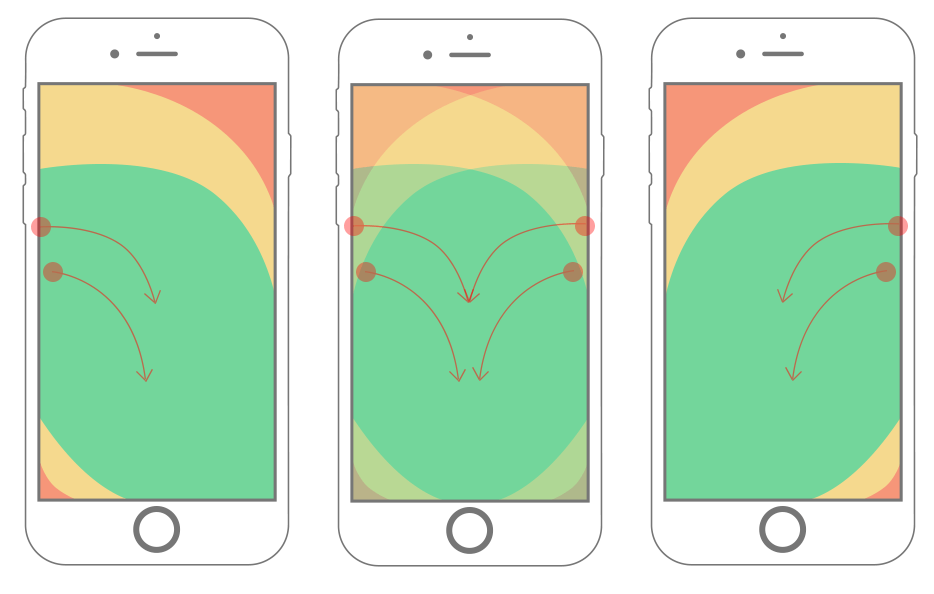
Opposable thumbs are nice to have, aren’t they? In addition to making us way cooler than jellyfish, thumbs are also key to how we interact with our mobile touchscreen devices. Hoober’s research shows that 49% of people hold their smartphones with one hand, relying on thumbs to do the heavy lifting. Clark took this even further and determined that 75% of interactions are thumb-driven.
With this understanding of hand placement, we can conclude that certain zones for thumb movement apply to most smartphones. We’ll define them as easy-to-reach, hard-to-reach and in-between areas.
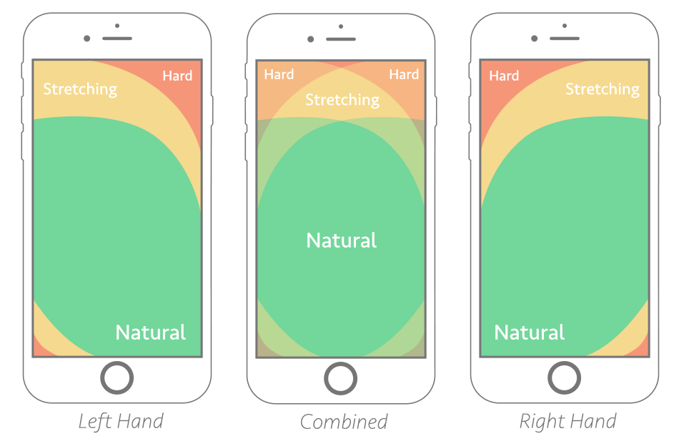
Thumb-zone mapping for left- and right-handed users. The “combined” zone shows the best possible placement areas for most users. (View the large version).
The trick is to design for the flow of the thumb zone. This provides a framework for making better design decisions, creating human-friendly experiences and getting fewer headaches. Through user testing and experimentation, I’ve discovered a few ways to use this knowledge in everyday development.
PROBLEMS WITH NAVIGATION
We all remember a time when mobile navigation was simply a dropdown list of links. It wasn’t pretty, but it got the job done. Today, we see endless examples of navigation patterns. What’s the best fit for the thumb zone?
The natural movement of the user is the first thing I learned to take into account. Ask questions: “Does my app have a long list of links?” “Do I need to mix menus?” “What goes well with my website design?” The answers to these questions will help you determine where to place navigational triggers and hooks.
If your app has a long list of links, then you’ll probably want to use a full-screen overlay menu. This type of menu affords space for you to organize the list, social buttons and other useful content. The pattern scales well between desktop and mobile devices, and the menu provides an opportunity to align clickable elements within the thumb zone.
Huge has always made great use of full-screen overlay menus on mobile devices:

Huge uses a full-screen overlay menu. (View large version)
On the flip side, if your app does not have a long list of links, then a sticky menu might be best. This type of menu attaches to the top or bottom of the screen and provides real estate for many links, depending on the design.
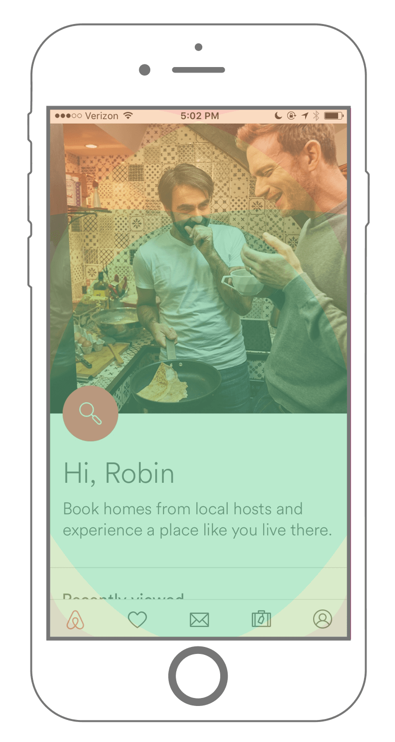
Airbnb’s mobile app has a sticky menu, attached to the bottom of the screen, providing easy access to important booking, messaging and listing information:

Airbnb’s mobile app has a fixed footer. (View large version)
If you have a large website, mixing menus might work. Because mixing menus can get complex, it’s helpful to prioritize menu links based on their importance in the app. Sticky menus are great for commonly visited links, whereas full-screen and drawer menus come in handy for important but not high-priority links.
Consider Facebook’s mobile app:

Facebook’s mobile app combines multiple fixed menus and drawers. (View large version)
Facebook mixes menus based on the size of content within them. In the screenshot above, we see two sticky menus, each containing valuable links for the user. The top sticky menu is in the stretch zone, but just low enough on the page that it feels natural. The bottom sticky menu items are organized to provide comfortable tapping of popular links.
By gathering user data, practicing good design and leveraging the thumb zone, Facebook is owning sticky menus. The next time you’re trolling your friend’s posts, remember the series of decisions that have made your trolling experience that much better.
Remember that in addition to keeping important navigation items within the thumb zone, placing links outside of the friendly zone is acceptable at times. The general rule is to keep frequently used links in the easy-to-reach zone and to keep infrequently used links in the hard-to-reach zone.
KEEPING CARDS FRIENDLY
Next, we’re going to review how a well-designed card pattern can work for your app. The card pattern has been widely used for a while now. Cards are quick, easy and predictable; they provide bursts of information in small doses, making it easy to deliver the right content at the right time.
Often, we couple cards with actions: send, save, done, close, etc.

Ponch: Wake Up Weather’s card pattern (View large version)
In this example we see the Poncho: Wake Up Weather app. This is a great example of placing actionable links within a card: The weather report doesn’t require a thumb tap, so it’s placed way inside the unreachable zone. The action item – in this case, a share button – is placed directly in the natural zone.
On the other side, Poncho places its “location search” and “use current location” links far inside the hard-to-reach zone. This is acceptable: A user would use those features infrequently, because the app remembers your
A great example of the swipe gesture is Google’s Inbox app.
location from the last time it was open.
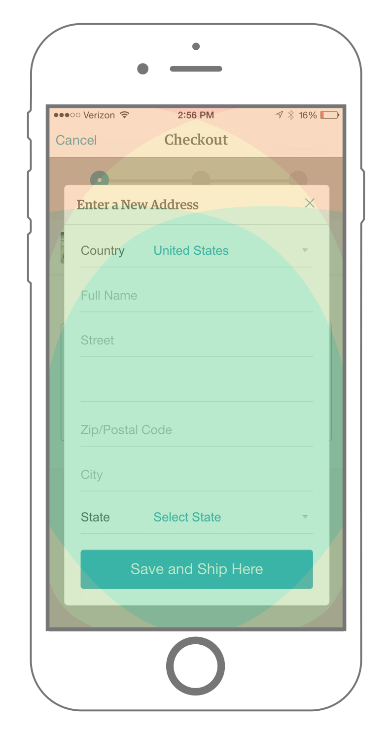
On the flip side, there are times when card patterns don’t utilize the thumb zone. A prime example of this is Etsy’s mobile app. During checkout, Etsy provides a form in a popup card for the user to enter their shipping information:
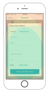
Etsy’s checkout flaws in the card pattern. (View large version)
At first glance, this use of a card seems appropriate and design-savvy. Digging deeper, we see flaws. The first problem is the “Cancel” link in the top-left corner. Does that link close the card or cancel the checkout process (if I’m confused, others surely will be, too). Also, The “x” is at the edge of the thumb zone, forcing the user to stretch to reach it.
Here’s a dilemma: Adding a close button to a top corner of a card is a common pattern, but it goes against the thumb zone rubric. If you’re breaking out of the thumb zone to meet a user’s expectations, look for an alternative solution. We could experiment by adding a close button at the bottom of the card, or – since cards are best when delivering short bursts of content – we could try limiting the length of content in cards.
As the card design fad takes hold, it’s a good idea to run designs through the thumb zone map to ensure that most elements are easily accessible and not confusing. Avoid following trends; instead, make human-oriented decisions throughout the design and development of your app.
GESTURES AND MOVEMENT
The gesture: tap, double-tap, swipe, drag, pinch and press. These are the icing on the smartphone cake. Gestures enable us to engage with technology through our sense of touch.
You might be able to guess where this going. Keep gestures within the thumb zone. More importantly, allow the user to perform gestures naturally. This seems obvious, but to really pull off a comfortable experience, it’s important to calculate where the gesture should happen.
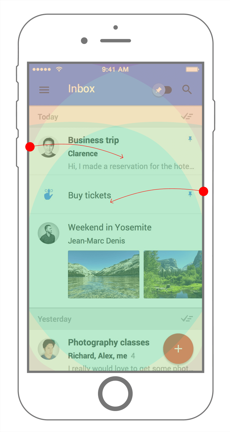
Let’s focus on the swipe interaction. Through swipe-tracking scripts, I found some really interesting movement data.
Visualization of swipe-gesture data found during user testing. (View large version)
In the map above, circles represent taps, and arrows represent swipes. The data that I collected from tests show that users usually swipe somewhere from the device’s edge towards the middle, diagonally downward. I also found that users generally swipe in the natural area of the thumb zone.
Originally, I had the misconception that users swipe horizontally across, which created problems when measuring thumb areas for swipe gestures. My design specifications did not provide enough room to swipe without triggering another swipe area simultaneously. As with most mobile design elements, consider the thumb space required for swiping. I’ve found an appropriate size of swipe areas to be at least 45 pixels tall and wide.
With all of this information, we can conclude that it’s better to place swipe-gesture actions in easy-to-reach areas, while also allowing enough space to prevent accidental inputs.
A great example of the swipe gesture is Google’s Inbox app.

Google Inbox supports swipe gestures in the right places, with the right amount of space. (View large version)
The smart decisions here are:
- keep swipe gestures out of hard-to-reach areas;
- provide enough tapping space;
- allow swipes to start anywhere in each email block element.
With all of this, gestures feel natural and comfortable, making email management faster and less complicated. Keep on keepin’ on, Google!
Summary
What have we learned? Hopefully, you better understand why the thumb zone is important. Remember these points:
- Mobile devices and languages will change, but as long as there are touchscreens, the thumb zone will remain a critical part of design.
- Navigational design is thumb-friendly when important links are in the easy-to-reach zone and unimportant links are in the hard-to-reach zones.
- Cards are a powerful design asset when content and actions are thumb zone-friendly.
- Determining swipe gesture areas becomes simpler when we consider how a person thumb swipes against a glass screen.
USEFUL LINKS
I’ll leave you with this: Keep reading! There is much to learn from other people in the industry. Below are a few links on the subject of designing for humans:
- Thumb zone template, (PSD)
- Designing for Touch, Josh Clark
- Designing Mobile Interfaces, Steven Hoober
- “Designing for Thumbs – The Thumb Zone,” Oliver McGough
- Check the thumb!, Nicolas J. Engler & Antonela Debiasi
- “One-Handed Mobile Interface,” Konstantin Savchenko, Medium
- “How Do Users Really Hold Mobile Devices?,” Steven Hoober, UXmatters
- “Facebook Paper’s Gestural Hell,” Scott Hurff
- “Designing for Large Screen Smartphones,” Luke Wroblewski
(da, yk, al, il)